Hopper, Crewdson, and Fullerton-Batten a technical dive
Julia Fullerton-Batton’s 2020 Project, Looking out from within is a beautifully shot and produced piece documenting life through lock down. The subjects stand inside their homes and Julia documents their life from outside as they gaze at the world that is now closed to them.
The project contains some truly beautiful and thoughtful images, but what I am concerned about in this post is the production of these images. Her stylistic inspiration for these is the painter, Edward Hopper. However, one cannot help but notice the similarities in styling and finishing to Gregory Crewdson.
I have long been an admirer of this style and it’s something I would like to bring to my work going forward. So, I thought I would dive in to what’s going on in the production of these images to help me make a step closer to this style.
Camera and lens choice? Well, Crewdson used to shoot his projects on large format cameras, due to the size and quality of the negatives that are produced on large format, but he has now moved to medium format digital which helps with the post production of the images. Fullerton – Batton on the other hand works largely with a digital full frame camera. So, in this case, I don’t think the camera and lens choice is bringing anything to the party.
Lighting of course plays a large part in the production of these images from both sides. It is here that we need to take a step back and look at what is trying to be archived with the lighting. Let’s take a look at the inspirational painter, Edward hopper and what is going on within his image, Nighthawks from 1942 and compare to Crewdson and Fullerton-Batton.

Edward hopper, Nighthawks, 1942
Of course, Hopper is a painter, so his eyes do not see as a camera sees, so the dynamic range in the picture is adjusted accordingly. He is not afraid to paint shadows, but the shadows we see, are although deep in some places, have enough detail in them that they are not blocked out; something which a camera is prone to do. These can be seen in the areas marked in blue.
Marked in green are the highlight areas, these are not over saturated and blown out. There is good detail in them and the colours of the lights rendered as the artist sees them.
Also, worth noting, that this scene is fairly wide angle in lens terms, but there’s no distortion in the image, a painter does not see lens effects and as such distortion. The verticals are straight and everything is parallel. Something which can be very difficult to work with when using a camera. These areas are marked in red.
While discussing lens effects, there are no tell-tale signs in a painting to show any lens effect whatsoever. There is no depth of field, everything is in sharp focus, also there are no lens flares, star bursts or whatnot. Simply put we don’t see these, only a camera sees like this.
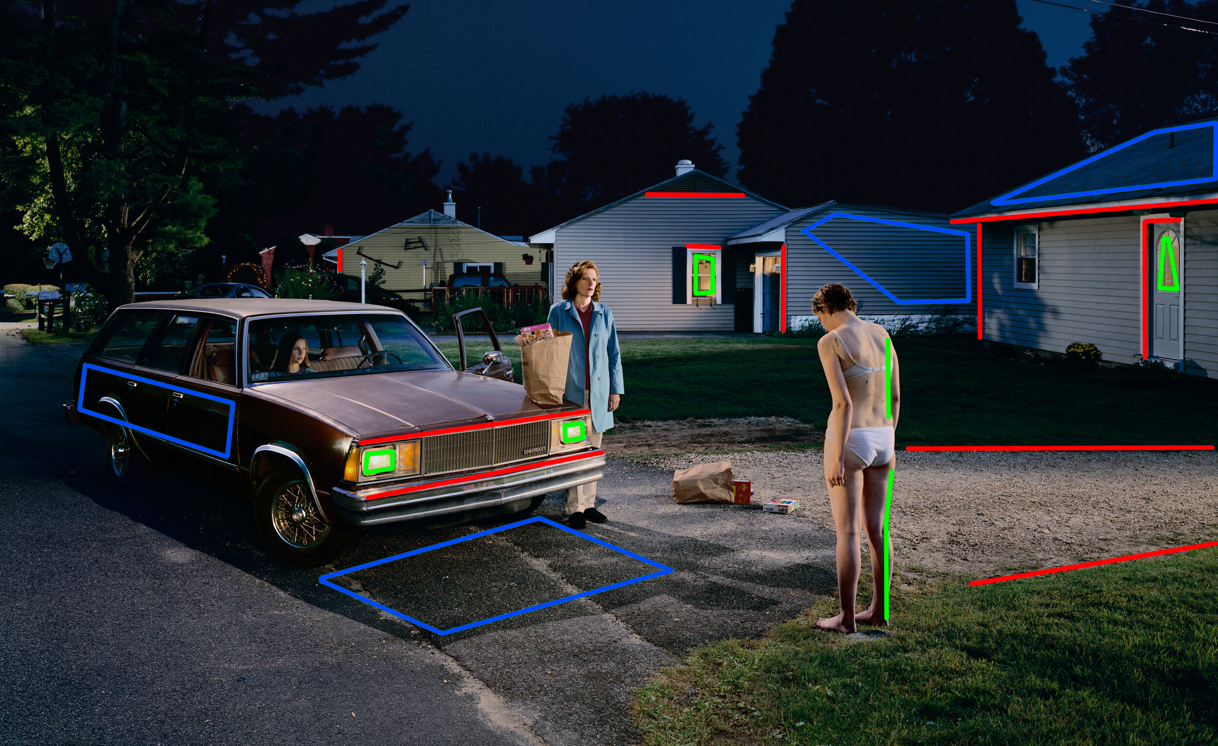
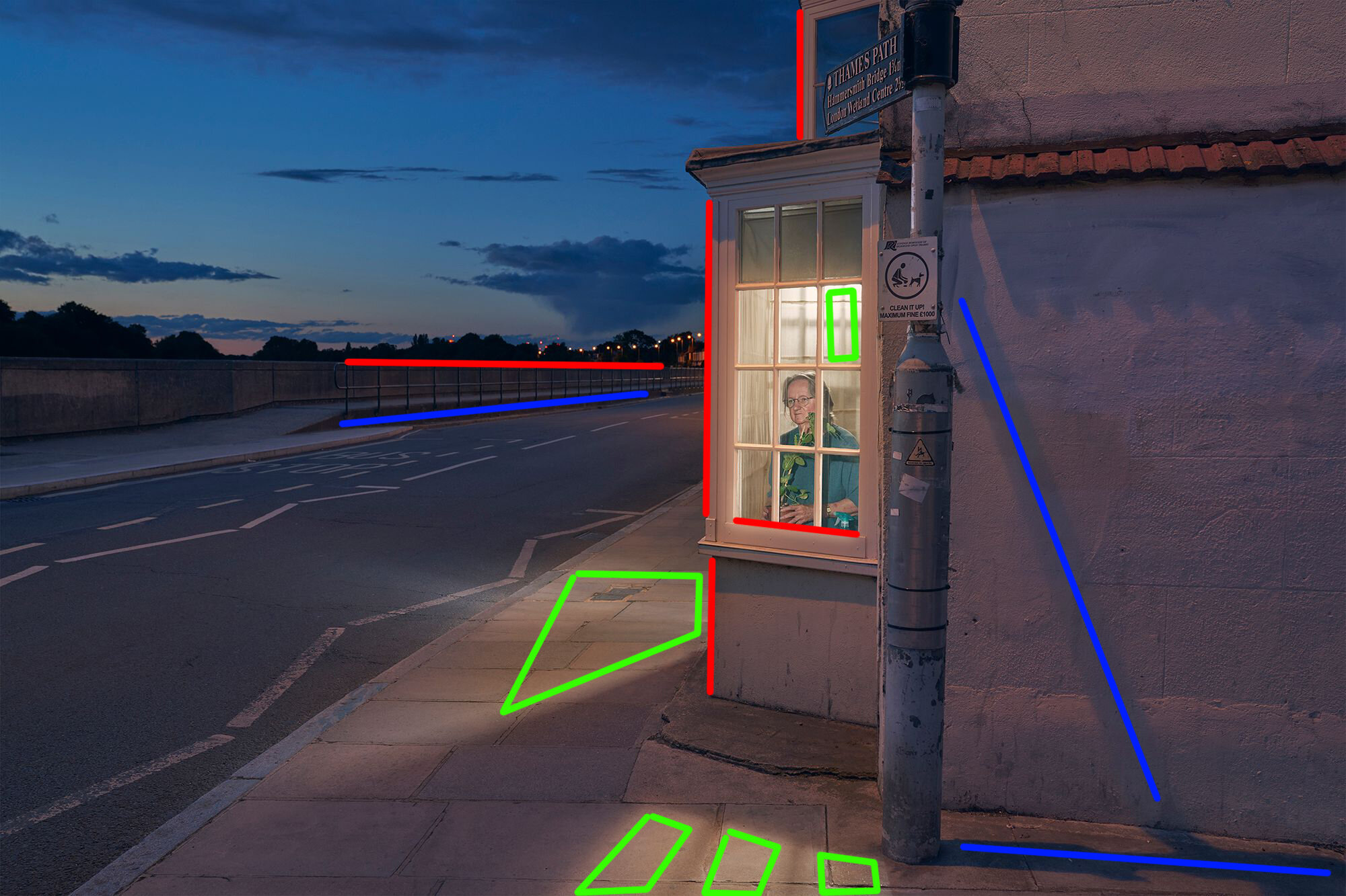
Now consider these images from Crewdson and Fullerton-Batton. The painterly style has been followed here. As noted in the painting by Hopper, I have also added the same colours to point out control of verticals, highlights and shadow areas by both these photographers. There is also almost no depth of field in these two photographs, everything is rendered in focus. Shadow details are rendered with enough detail to help us appreciate the scene, the highlights also shot in the same way, so nothing is blown out and lights rendered in the colour tones we expect to see them. Verticals are also well controlled with no lens distortions and lens effects going on anywhere. The crispness of the details adds to the painterly effect and likeness to Hopper’s work, while the subject are painted in a softer light.
Colour saturation in all of these pieces is also worth noting. Colours can be bold, but none of them are overly saturated or overly bright.
In summary, control of these aspect is key to the production work being done on these images. A technical approach to this would be to make sure as much as possible, verticals are vertical and the lines flow in the expected directions with as little distortion as possible. Anything else will need to be straightened in post production. Exposures for dark areas and light areas need to be carefully controlled without loosing contrast or flattening the scene. This would either be lighting on set to have the right colour, intensity and direction of light, or in some cases multiple exposures for these areas to be blended in post production. In addition the depth of field and lens effects must also be controlled. This may mean multiple exposures to ensure that the depth of field can be achieved, in addition shots at varying apertures may be needed to control lens effects such as star bursts from lights.

Erwin Olaf, Sunshine Boys, De La Mar Theatre, 2009
As a bonus, here is another one of my favourite images, this time by Erwin Olaf. Looking at this image in details and comparing to the analysis above, we can see the exact same things going on here. The verticals and lines, the shadow and highlight areas and indeed the exposures on the figures, with no lens effects. I think it gives a wonderful look to an image.